Mi Página: Empowering sellers to build their brand and community
Mercado Libre
Design Strategy | UX/UI | Product design
Context
Until recently, only official stores could show a clear brand identity within Mercado Libre. Independent sellers, who make up the majority of the platform, had few ways to stand out or express their identity.
Meanwhile, Mercado Shops, a product from Mercado Libre’s ecosystem, offered sellers the ability to create external e-commerce sites, but those sites lived outside Mercado Libre. Sellers had to bring their own traffic, which limited visibility and diluted the experience, particularly for small sellers.
As Mercado Libre began integrating all verticals under one identity, with Mercado Pago switching its colors to yellow to match the ones from the marketplace, and Mercado Play, the streaming product living within the same ecosystem, maintaining an external, competing product was no longer sustainable.
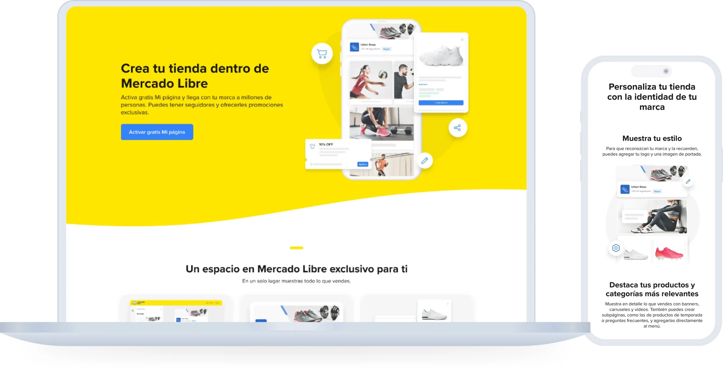
This 2025, Mercado Shops is being sunset, and its users have until the end of the year to migrate to Mi Página, a product that lives within the marketplace, designed to give sellers visibility, identity, and tools to grow their community inside Mercado Libre.
Before: The old design displayed products in a grid identical to search results, offering no visual distinction for each seller.
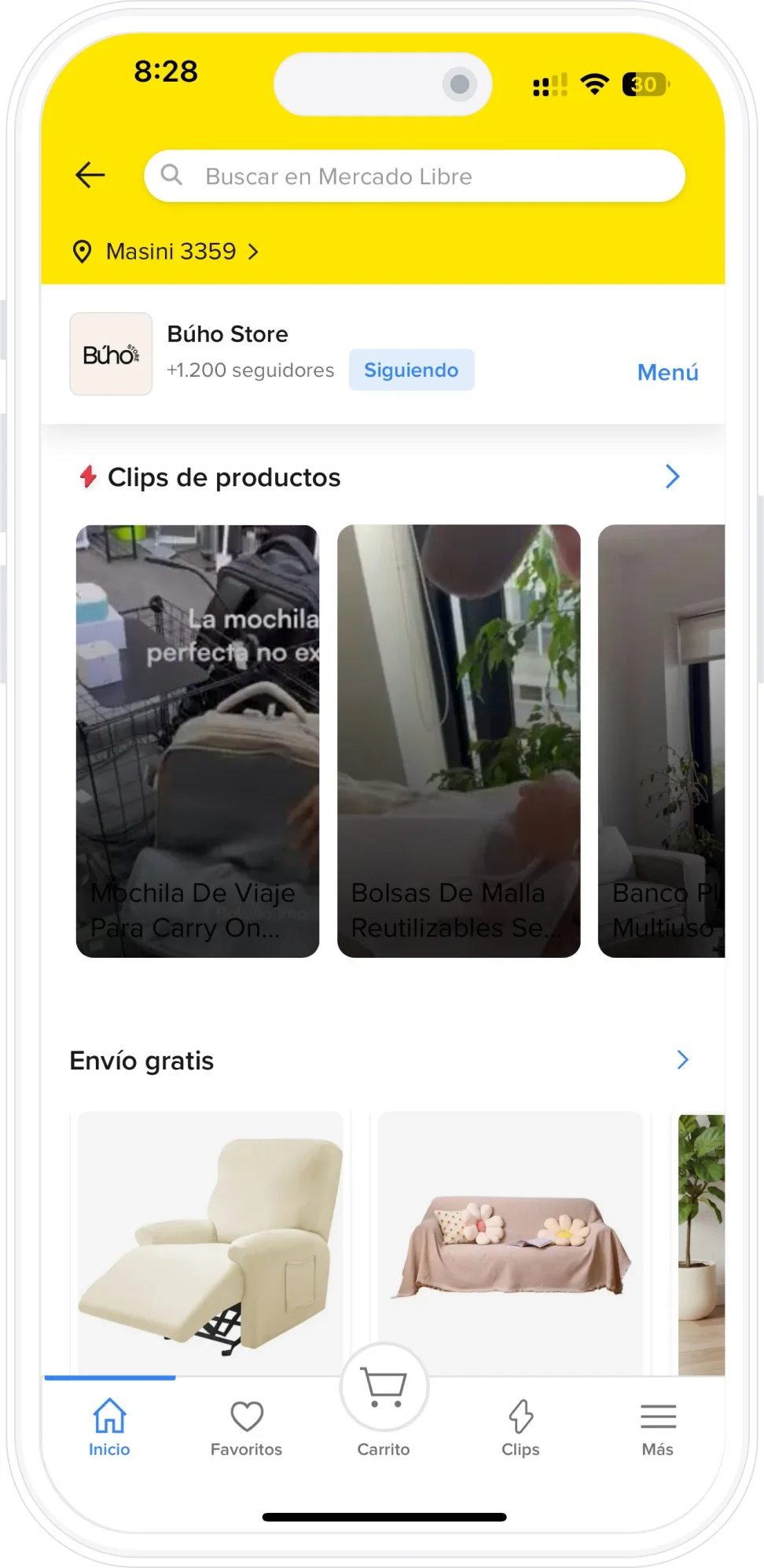
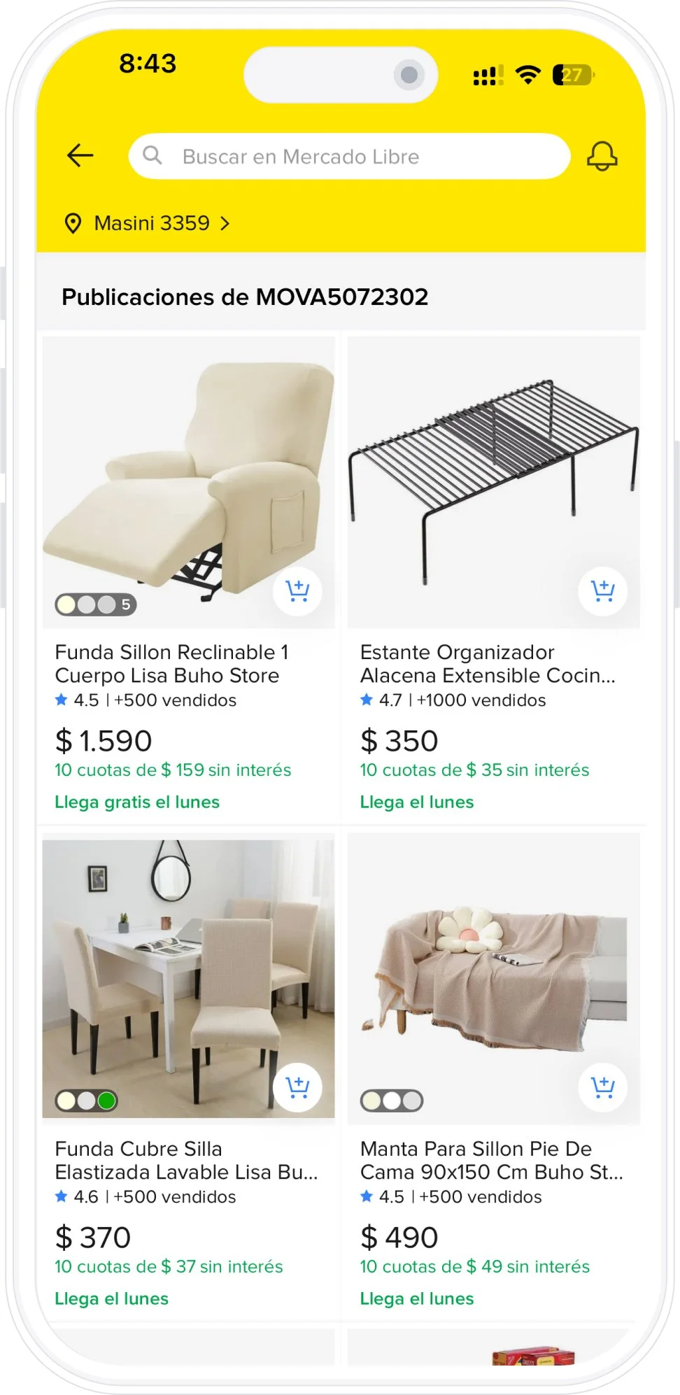
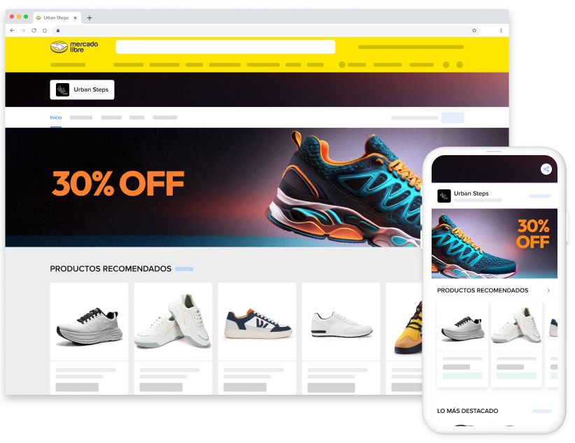
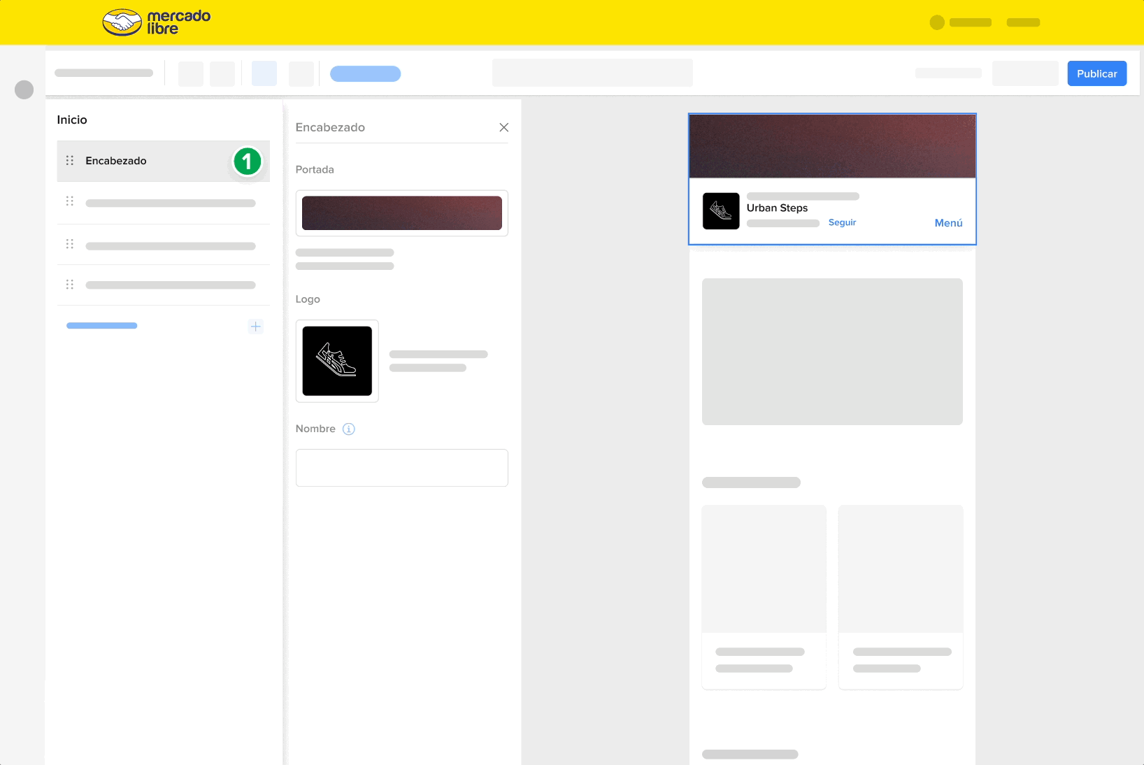
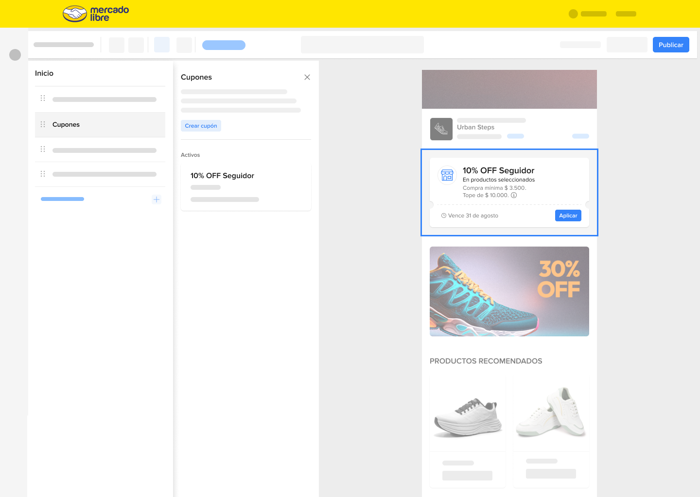
After: The new design introduces the seller’s store identity, name, logo, followers, follow button, navigation menu, and customizable components selected by the seller.
Objective
Design a native, scalable experience within the marketplace that allows all sellers, regardless of size or brand status, to:
Reflect their brand identity through logo, cover, and featured products.
Reach new audiences leveraging Mercado Libre’s internal traffic.
Build loyalty and community through followers and exclusive content.
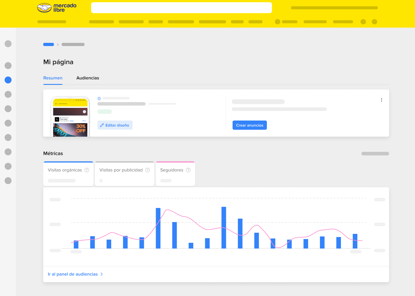
Access metrics and promotional tools to boost engagement and sales.
My contribution
I was the first UX designer selected to work on “Mi Página” when it was still an exploratory initiative. My focus was to understand the product opportunity and define how sellers could personalize their page within the marketplace while maintaining usability, scalability, and alignment with Mercado Libre’s design system.
Working closely with the Mercado Shops team, we shared the same site builder where sellers created their pages. We redesigned the modular components that sellers use to showcase products and categories within their page, anticipating scalability for future seller profiles, with small but crucial differences for each product. I worked to reduce cognitive load in a highly complex product filled with information, ensuring clarity and ease of setup.
Because Mi Página was one of Mercado Libre’s top 10 strategic projects, I often worked under tight deadlines, high visibility, and continuous iterations driven by senior stakeholders. This required balancing attention to detail with agility in decision-making.
Finally, I acted as the bridge between Mi Página and other teams, facilitating collaboration, ensuring design consistency, and helping other squads integrate their features into the seller experience ecosystem.
Process
The design process for Mi Página was highly collaborative and iterative, shaped by constant alignment between UX, Product, and Business teams. Rather than following a linear path, it evolved through exploration, benchmarking, and rapid decision-making around scope and scalability.
Exploration
We started by analyzing how other marketplaces allowed sellers to showcase their brand, from Amazon Stores to Shopee. Through workshops with the product team, we defined what we wanted Mi Página to represent for Mercado Libre: a space for sellers to show their brand within the marketplace ecosystem.
After this phase, I transitioned back to my original team. When Mi Pagina entered its next development cycle a year later, I rejoined to keep shaping the exprience and ensure deign continuity.
Integration and iteration
I connected Mi Página with other ecosystem tools and teams, suchs as Coupons, Broadcast Channels, and Campaign Manager, ensuring consistency and scalability across experiences.
Together with my team, we refined the product based on adoption and performance data. Iterations focused on applying learnings shared by the Mercado Shops team, improving shared tools, and simplifying setup flows. We also enhanced the visibility of metrics and strengthened the sense of ownership sellers felt over their pages.
Design and priorization
After aligning with the Mercado Shops’ team, we agreed to share the same site builder. Based on that, I designed a version of the interface that aligned to Mercado Libre’s design system while reducing cognitive load.
I prioritized the most-used components by sellers, balancing impact, usage frequency, and visibility for both web and mobile view.
In parallel, I worked on the Mi Página Hub, together with another designer, to help sellers track their page’s performance and metrics. This included defining information architecture and data visualization patterns.
Impact
The launch of Mi Página transformed how sellers present themselves within Mercado Libre.
For the first time, small and mid-tier sellers could build a recognizable brand identity inside the marketplace, reaching new audiences without relying on external traffic.
The product’s impact extended beyond UX. It became a strategic pillar of ecosystem integration during the sunset of Mercado Shops.
During its first year, Mi Página generated over USD 1 million in subscription revenue, proving the tangible business value of investing in seller brand experiences.
Sellers who activated their page saw stronger engagement and follower growth, helping Mercado Libre move toward a more social and brand-centric marketplace.